The Letterform 101
Scroll to reveal the parts that make up every letterform.
Anatomy of the Letter
Every letterform is built from the same handful of parts. Here's the full vocabulary type designers use to talk about them.
Apex
The point at the top of a letter where two diagonal strokes meet, as in the peak of “A” or “M”. Because a sharp point looks optically shorter than a flat one, type designers routinely flatten, round, or overshoot it slightly to correct the illusion.
Arm
A horizontal or upward-diagonal stroke that is open at one end, as in “E”, “K”, or “Y”. Its length and angle do a lot of quiet work in setting a typeface's mood — stretched arms read as confident and open, clipped ones as tighter and more businesslike.
Ascender
The part of a lowercase letter that rises above the x-height, as in “b”, “d”, “h”, “k”, “l”, “t”. How far it climbs, often past the cap height, shapes a text block's vertical rhythm and how much leading it needs to breathe.
Bar (Crossbar)
The horizontal stroke that connects two strokes or spans the width of a letter, as in “A”, “H”, “e”, “f”. Its height — set high, centered, or low — is one of the most reliable tells for identifying a typeface at a glance.
Beak
A small serif-like spur at the end of an arm, common in some serif and slab typefaces on letters like “E”, “F”, “T”. Purely decorative rather than structural, it's often the fastest way to place a typeface's stylistic lineage.
Bowl
The curved stroke that encloses a counter, as in “b”, “d”, “g”, “o”, “p”, “B”, “D”, “P”, “R”. Single-story letters carry one bowl; a double-story lowercase “g” stacks two into a figure eight.
Bracket
The curved transition connecting a serif to the main stroke it supports. How hard or soft that curve is marks a typeface's family: a generous fillet reads Oldstyle, a sharp right angle reads slab, and no bracket at all reads Didone.
Counter
The fully or partially enclosed space within a letter, such as the inside of “o”, “e”, “a”, “g”. Its size and shape matter more for legibility at small sizes than almost any other feature, since a tight counter is usually the first thing to blur or clog.
Crotch
The interior angle where two strokes meet, as in “V”, “W”, “Y”. A crotch cut too sharp traps ink in print and looks clogged on screen, so it's often rounded or opened slightly to compensate.
Descender
The part of a lowercase letter that extends below the baseline, as in “g”, “j”, “p”, “q”, “y”. Alongside the ascender, its depth is one of the biggest factors in how much line spacing a typeface needs.
Ear
The small stroke projecting from the top-right of the bowl of a lowercase “g” (or sometimes “r”). It carries no functional job beyond decoration, which makes it one of the more personality-driven details a type designer gets to play with.
Em / En
Units of measure equal to the point size (em) or half the point size (en) of a typeface, used for spacing and indentation. The names come from the width of a capital “M” and “N” in metal type, though digitally an em is now a fixed abstract unit rather than tied to any single letter.
Eye
The enclosed counter of a lowercase “e”. Its angle and aperture — open, closed, or somewhere in between — is one of the most telling details for distinguishing typefaces that otherwise look alike.
Finial
The tapered or curved end of a stroke that terminates without a serif, common on letters like “a”, “c”, “f”, “j”, “r”. Whether it closes in a ball, a point, or a straight cut is a signature detail that repeats across a typeface's whole lowercase.
Hairline
The thinnest stroke in a typeface with strong stroke contrast, typically found on the horizontal strokes of high-contrast serif faces. Extreme hairlines, as in Didone faces like Bodoni, read as elegant at display sizes but can vanish in small print or on low-resolution screens.
Kern
The adjustment of space between two specific letter pairs to achieve visually even spacing. It's distinct from tracking, which shifts every character uniformly rather than correcting individual pairs like “AV” or “To”.
Leg
A downward diagonal or vertical stroke attached at one end, as in “K”, “R”, “k”. Its angle, and where it meets the stem, can make an “R” read as sturdy and upright or loose and calligraphic.
Ligature
A single glyph that combines two or more letters into one character, most commonly “fi” or “fl”. They solved a real collision problem in metal type — an “f”'s overhanging arm crashing into the dot of a neighboring “i” — and survive today mostly as a typographic refinement.
Link
The stroke that connects the bowl to the loop in a double-story lowercase “g”. It's one of the most varied details across typefaces, ranging from a thin straight neck to an elaborate curved flourish.
Loop
The lower, often closed, counter of a double-story lowercase “g”. Some typefaces drop it for a simpler single-story “g” instead, often the quickest way to tell a humanist sans from a grotesque at a glance.
Serif
The small projecting stroke at the end of a letter's main strokes, characteristic of serif typefaces. Its origin is debated, but most trace it to the chisel marks Roman stonecutters left finishing an inscribed stroke, later formalized by the broad-nib pen.
Shoulder
The curved stroke that flows out of a stem, as in “h”, “m”, “n”. Its curve tends to echo the bowl of related lowercase letters, keeping a typeface's rhythm consistent from one letter to the next.
Spine
The main curved stroke of the letter “S” or “s”. Drawing one that reads as balanced rather than lopsided is one of the harder problems in type design, since the letter has no straight stroke to anchor it visually.
Spur
A small projection extending from a curved stroke, often found where a bowl meets a stem, as in “G”. It's a small structural detail that keeps the join from reading as though it simply stops.
Stem
The primary, usually vertical, stroke of a letter. Its width relative to the letter's height is one of the biggest drivers of how heavy or light a typeface feels overall.
Stress (Axis)
The direction of thickness variation in a curved stroke, visible where a letterform is thickest. Oldstyle faces lean their stress diagonally, echoing a broad-nib pen; Modern (Didone) faces straighten it to perfectly vertical.
Swash
A decorative flourish that extends or replaces a terminal or serif, often found in italic or script styles. They're typically drawn as alternate glyphs reserved for display sizes, since their exuberance can overwhelm a typeface once set as running text.
Tail
A descending stroke, often decorative, as in the diagonal stroke of “Q” or “R”, or the descender of “y”. It's frequently the one place a typeface allows itself real flourish, even in otherwise restrained, businesslike designs.
Terminal
The end of a stroke that does not carry a serif, whether curved (as in “s”) or straight-cut. Common shapes include the ball terminal, the teardrop, and the straight or “cut” terminal, each giving a typeface a distinct character.
Vertex
The point at the bottom of a letter where two diagonal strokes meet, as in the base of “V” or “W”. Like the apex, it's often extended slightly past the strokes' natural meeting point to correct for the same optical shortening.
Measurements & Metrics
The system of measurement that keeps type consistent, legible, and precisely spaced.
Baseline
The invisible line upon which the base of each letter sits (excluding descenders).
x-height
The height of a typeface's lowercase letters, excluding ascenders and descenders, measured from the baseline to the top of a letter like "x".
Cap height
The height of a typeface's capital letters, measured from the baseline to the top of a flat-topped capital like "H".
Ascender height
The distance from the baseline to the top of the tallest ascending lowercase strokes, such as "b" or "l".
Descender depth
The distance from the baseline to the bottom of the lowest descending lowercase strokes, such as "g" or "y".
Em
A unit of measure equal to the current point size of a typeface — historically the width of a capital "M".
En
A unit of measure equal to half an em, traditionally the width of a capital "N".
Point size
The overall size of a typeface, measured in points (1 point = 1/72 inch), based on the em square rather than any single visible feature.
Tracking
Uniform adjustment of letter-spacing applied across a range of text, used to loosen or tighten overall density.
Kerning
The adjustment of space between individual letter pairs to correct uneven or awkward gaps.
Leading
The vertical space between consecutive lines of text, named after the strips of lead once inserted between lines of metal type.
Optical size
Variants of a typeface subtly redrawn for specific size ranges — text optical sizes carry more open counters and sturdier strokes than display sizes of the same design.
Classification of Styles
Typefaces fall into broad families, each with its own history, structure, and mood.
For most of print history typefaces were sorted the way a printer would sort them — by foundry, by trade, by punchcutter — not by shape. The first real attempt at a rigorous classification came only in 1921, when the French printer Francis Thibaudeau proposed four families based purely on serif construction: Elzévir (triangular, bracketed serifs), Didot (thin, filiform serifs), Egyptian (thick, slab-like serifs), and Antique (no serifs at all), with everything else swept into a catch-all “writings and fantasies” group. It was clean, but the 20th century's flood of new typefaces quickly outgrew it.
In 1954 the French typographer and critic Maximilien Vox proposed something far more ambitious: eleven classes tracing not just what a typeface's serifs looked like, but where its letterforms came from historically — Vox described it as genealogy, since in his words “every living being proceeds from two parents.” Adopted by the Association Typographique Internationale (ATypI) in 1962 and later formalized as British Standard BS 2961, Vox-ATypI became the closest thing type design ever had to an official taxonomy: Humanes and Garaldes for the earliest Renaissance romans, Réales and Didones tracing the swing from Baskerville's transitional forms to Bodoni's stark modern contrast, Mécanes for slab serifs, Linéales for sans-serifs, Incises for inscriptional letters, Scriptes and Manuaires for calligraphic and handwritten forms, Fractures for blackletter, and a final catch-all for non-Latin scripts.
It held for decades — but that last category was also its weak point. In April 2021, ATypI formally de-adopted Vox-ATypI, acknowledging that a system built entirely around Latin letterforms had no real answer for Cyrillic, Arabic, Hebrew, or the world's other writing systems, and convened a working group to build something broader. In practice, most contemporary foundries had already moved on: rather than one rigid taxonomy, they increasingly tag typefaces by a mix of shape and function — looser categories and filters that balance form with how a typeface actually gets used.
We follow that same spirit here: five practical families rather than eleven historical ones, each shown in typefaces from our own library alongside a few open-source ones.
Serif
- Young Serif
- Debut Serif
- Sablé
Serif typefaces feature small projecting strokes at the ends of their letters, a legacy of chiseled Roman inscriptions and the broad-nib pen. They read as traditional, authoritative, and highly legible in long-form text.
- Oldstyle : Low contrast between thick and thin strokes, angled stress, and bracketed serifs — modeled on Renaissance calligraphy (e.g. Garamond).
- Transitional : Higher stroke contrast and more vertical stress than Oldstyle, bridging classical and modern forms (e.g. Baskerville).
- Modern (Didone) : Extreme stroke contrast, thin unbracketed serifs, and vertical stress, born from the precision of 18th-century engraving (e.g. Bodoni, Didot).
- Slab (Egyptian) : Thick, heavy, often unbracketed serifs with minimal stroke contrast, developed for high-impact advertising (e.g. Clarendon).
Sans-serif
- Debut Sans
- Bolida Brut
- Panamera
- Formera
- Lil Grotesk
Sans-serif typefaces omit serifs entirely, favoring clean, uniform strokes. They dominate screens and modern branding for their clarity at small sizes.
- Grotesque : The earliest sans-serifs, with slightly irregular proportions and a mechanical feel (e.g. Helvetica, Akzidenz-Grotesk).
- Geometric : Built from simple geometric shapes — circles, triangles, squares — for a rational, modernist look (e.g. Futura).
- Humanist : Proportions derived from handwriting and classical serif forms, offering warmer, more legible letterforms (e.g. Gill Sans).
Script
- Pinyon Script
- Kipling Script
Script typefaces imitate handwriting or calligraphy, with connecting or flowing strokes. We don't (yet) draw script typefaces ourselves, so the specimens below borrow one Google Fonts face and one licensed face from our own collection.
- Formal : Modeled on formal copperplate engraving and calligraphy, used for invitations and luxury branding (shown above in Pinyon Script).
- Casual : Looser, brush- or pen-based strokes that evoke spontaneity and informality (shown above in Kipling Script).
Display
- Cachemire
- Parsonic
- Obliqa Glitch
- Badinguet
- Nemoy
Designed for headlines and large sizes rather than body text, display typefaces prioritize personality and impact over extended readability.
Monospace
- Boolean
Every character occupies the same horizontal width, a legacy of typewriters, now essential for code and tabular alignment.
History of Typography
From Gutenberg's press to variable fonts: the milestones that built the letterforms we use today. Click any image to zoom in.
 c. 1450
Gutenberg & Movable Type
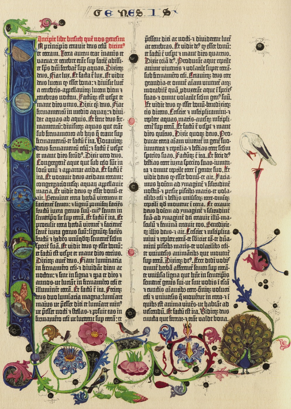
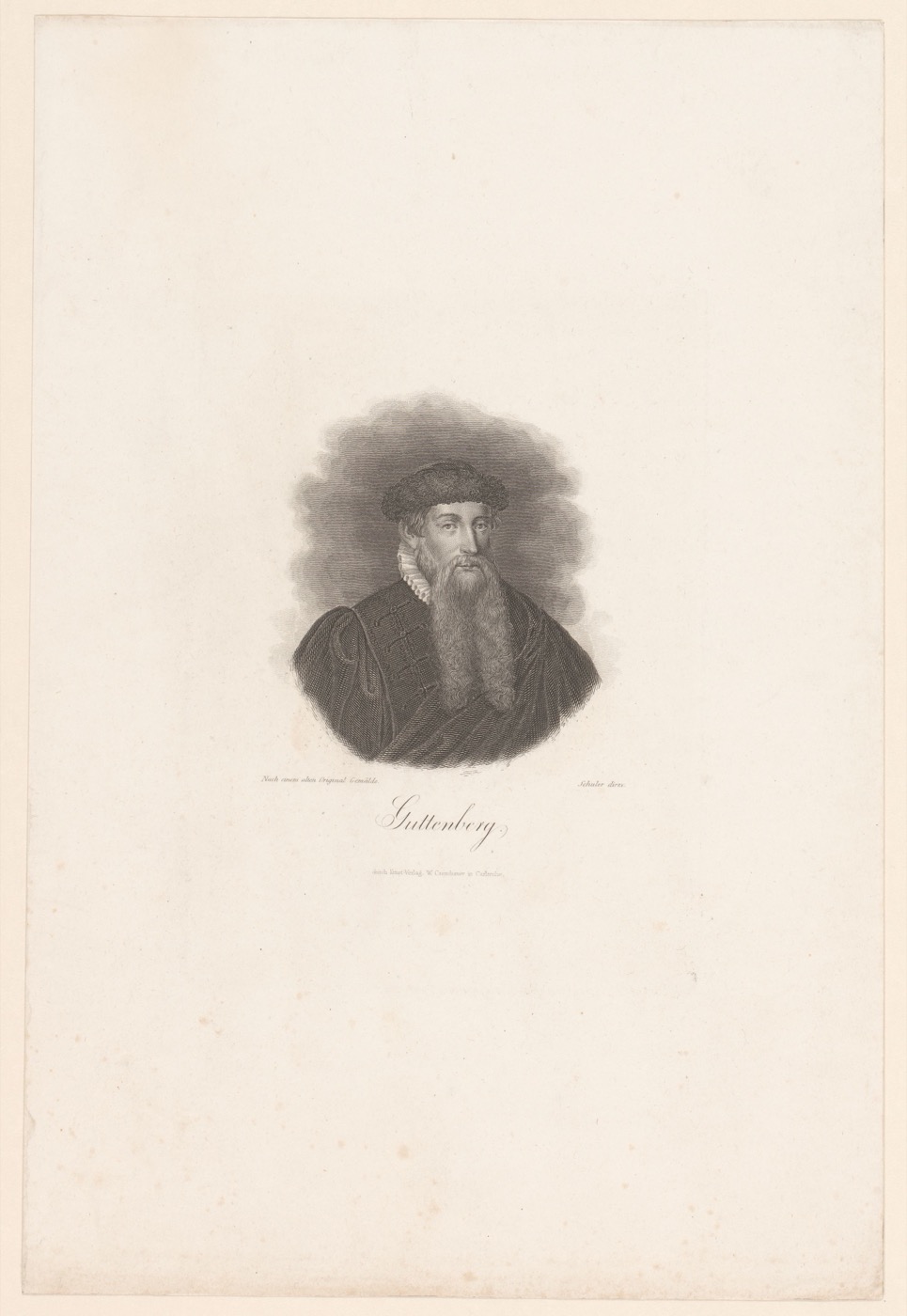
Johannes Gutenberg's press in Mainz was not the world's first movable type — Bi Sheng had cast individual clay characters in China four centuries earlier — but it was the first built for an alphabet, and the first married to a metal alloy hard and precise enough to cast thousands of identical, reusable letters. His workshop cut a blackletter (Textura) face deliberately modeled on the manuscript hands readers already trusted, so a printed page wouldn't look suspiciously mechanical. By 1455 that type had set the 42-line Bible, and within decades the press had out-produced a millennium of scribes, feeding the Renaissance and Reformation with a speed handwriting never could.
 1470s
1470sNicolas Jenson & the First Romans
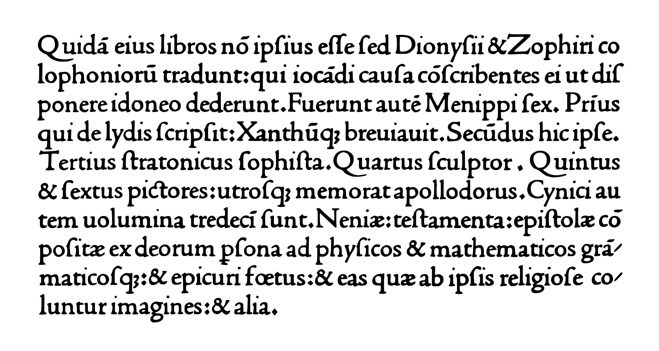
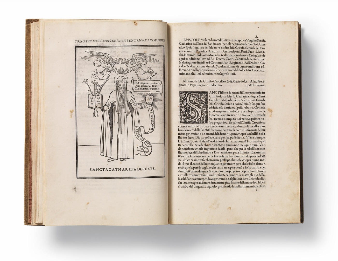
A French engraver working in Venice, Jenson broke from blackletter's condensed, angular grip and cut a roman type that fused Gothic sturdiness with the rounder, more open forms of Italian humanist handwriting. His own advertisements claimed the type "does not hinder one's eyes, but rather helps them and does them good" — a design argument as much as a sales pitch, and one later type designers kept making. Jenson's roman would be revived centuries on (most famously as Centaur, cut by Bruce Rogers in 1914) and remains a reference point for what a humanist serif should look like.
 1501
1501Aldus Manutius & the Italic
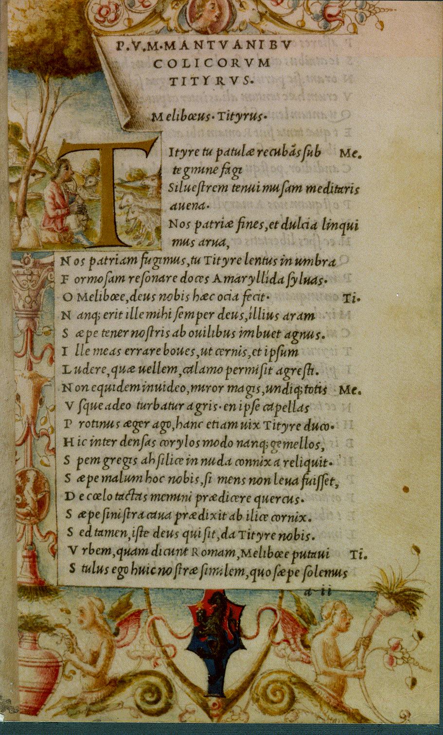
Venetian scholar-printer Aldus Manutius wanted to put classical literature into readers' pockets, not just libraries — so his punchcutter Francesco Griffo cut a slanted, closely-fitted type modeled on humanist cursive handwriting, letting far more text fit on a page. The resulting 1501 edition of Virgil was the first book ever printed entirely in italic, launching Aldus's line of small, portable classics at a fraction of the usual size and price. What began as a space-saving trick became a permanent second voice in the typographic toolkit, still used today for emphasis rather than economy — his printer's mark, an anchor wound by a dolphin, is still one of the most recognizable trademarks in the history of printing.
 16th century
Garamond & the Oldstyle Tradition
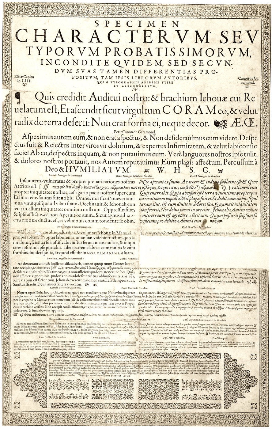
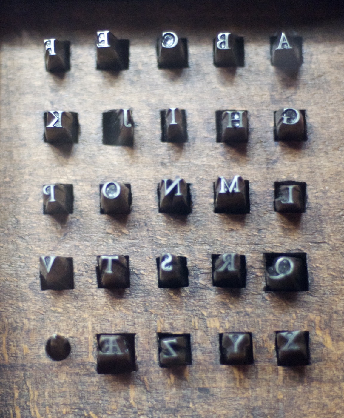
Working in Paris from the 1530s until his death in 1561, Claude Garamond cut romans with low contrast, a calligraphic diagonal stress, and soft bracketed serifs — proportions traced directly to the humanist pen rather than an engraver's tool. His punches were sold off piecemeal after his death; the only complete surviving set lives at the Plantin-Moretus Museum in Antwerp, and the type is best known today through a 1592 specimen sheet issued by the Egenolff-Berner foundry, three decades after he died. Prized as much for economy as elegance — Garamond's letters famously use less ink than most of their rivals — it became the default "old style" serif across Europe for two centuries.
 1757
1757Baskerville & the Transitional Style
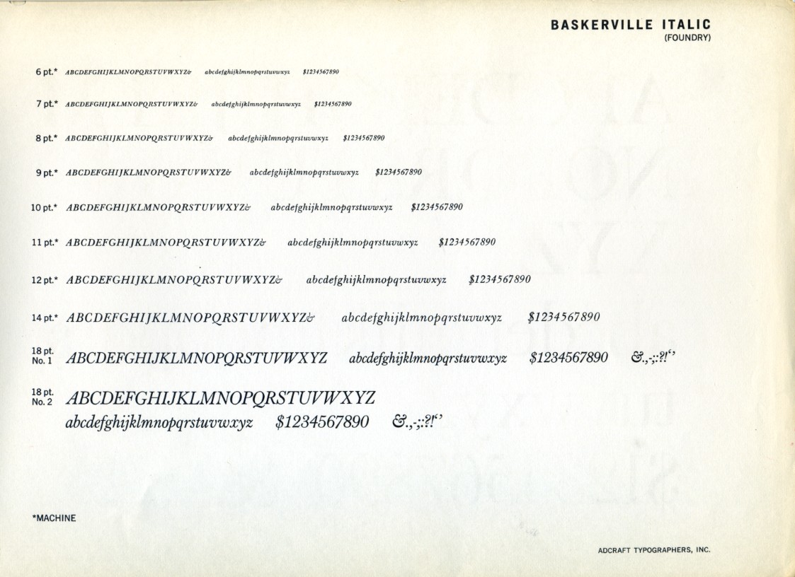
A Birmingham writing-master turned printer, John Baskerville chased a crisper page than 18th-century paper and ink could support — so he invented his own: a smoother hot-pressed paper, a denser black ink, sharper punches cut with his engraver John Handy. The higher stroke contrast and more vertical axis this precision allowed made his 1757 Virgil look startling next to Caslon's warmer old-style romans; English critics called it eye-straining, and some accounts have it informally shunned at Cambridge. The French and the young United States thought otherwise — Benjamin Franklin was an admirer — and the "transitional" style Baskerville pioneered became the hinge between Oldstyle tradition and the Modern extremes still to come.
 1780s–1790s
Bodoni & Didot Define the Modern
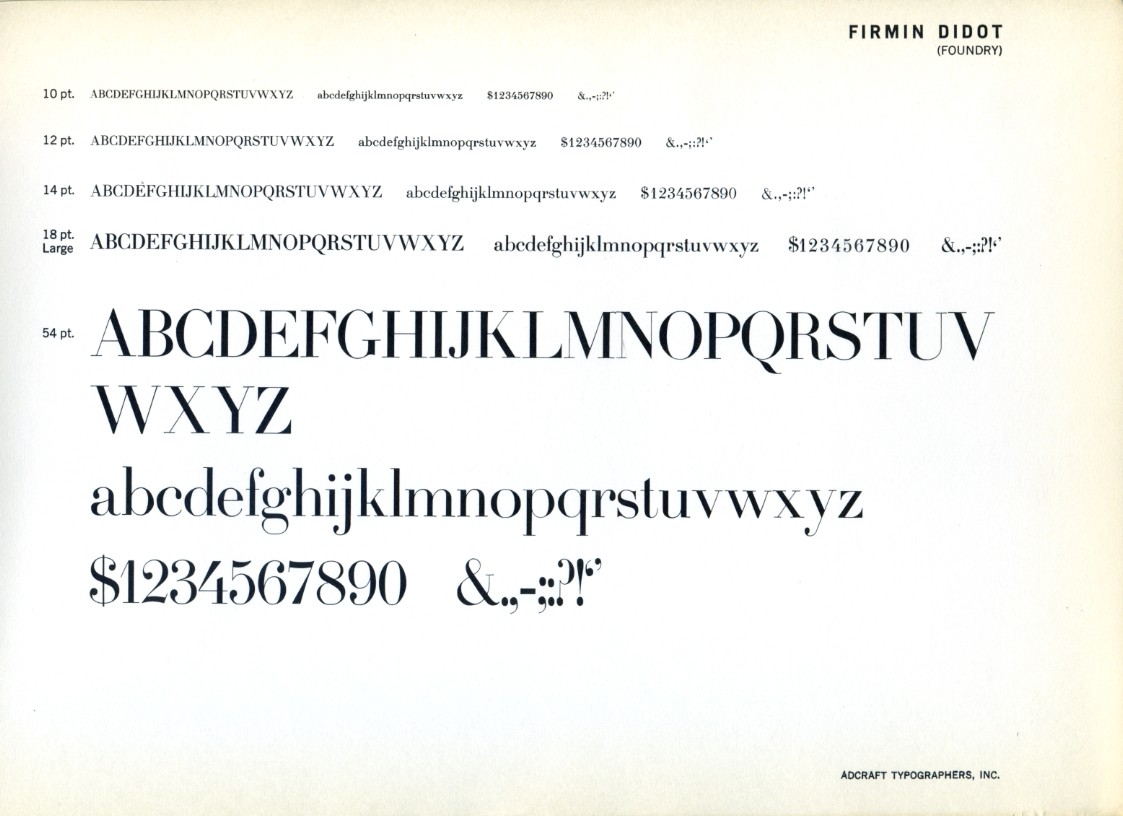
Giambattista Bodoni, court printer to the Duke of Parma, and Firmin Didot in Paris arrived independently at the same conclusion: the copperplate engraver's precision could be pushed into type itself. Both pared their romans down to hairline, unbracketed serifs and near-vertical stress, driving stroke contrast to an extreme no pen could produce by hand — a look that read as pure Enlightenment rationalism, all geometry and no trace of the hand that cut it. Bodoni's own Manuale Tipografico, a 265-page specimen of romans, italics, and ornament, was published by his widow in 1818, five years after his death, and the Didone style it showcased still signals luxury and fashion whenever a masthead needs to look expensive.
 Early 19th century
Slab Serifs for the Industrial Age
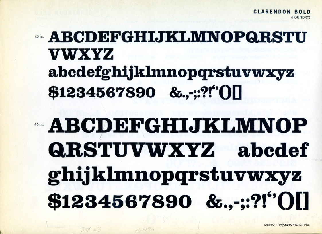
Industrial-era advertising needed type that could shout from a wall, not just sit quietly on a page — and the delicate hairlines of Didone romans couldn't survive at poster scale. Vincent Figgins answered with what may be the earliest documented slab serif, in an 1815 specimen (some sources date the actual issue to 1817): thick, block-like serifs with almost no contrast, built to stay legible in wood type at enormous sizes. Early reviewers reportedly dismissed the style as a "typographic monstrosity," and the exotic label "Egyptian" stuck to it more from Napoleon's 1798 Egyptian campaign and the ensuing craze for all things Egyptological than from any real connection to Egyptian writing. Robert Besley's 1845 Clarendon later softened the form with bracketed serifs and became the genre's most enduring name, still doing duty on wanted posters and Old West signage in the popular imagination.
 1816
1816The First Sans-Serif
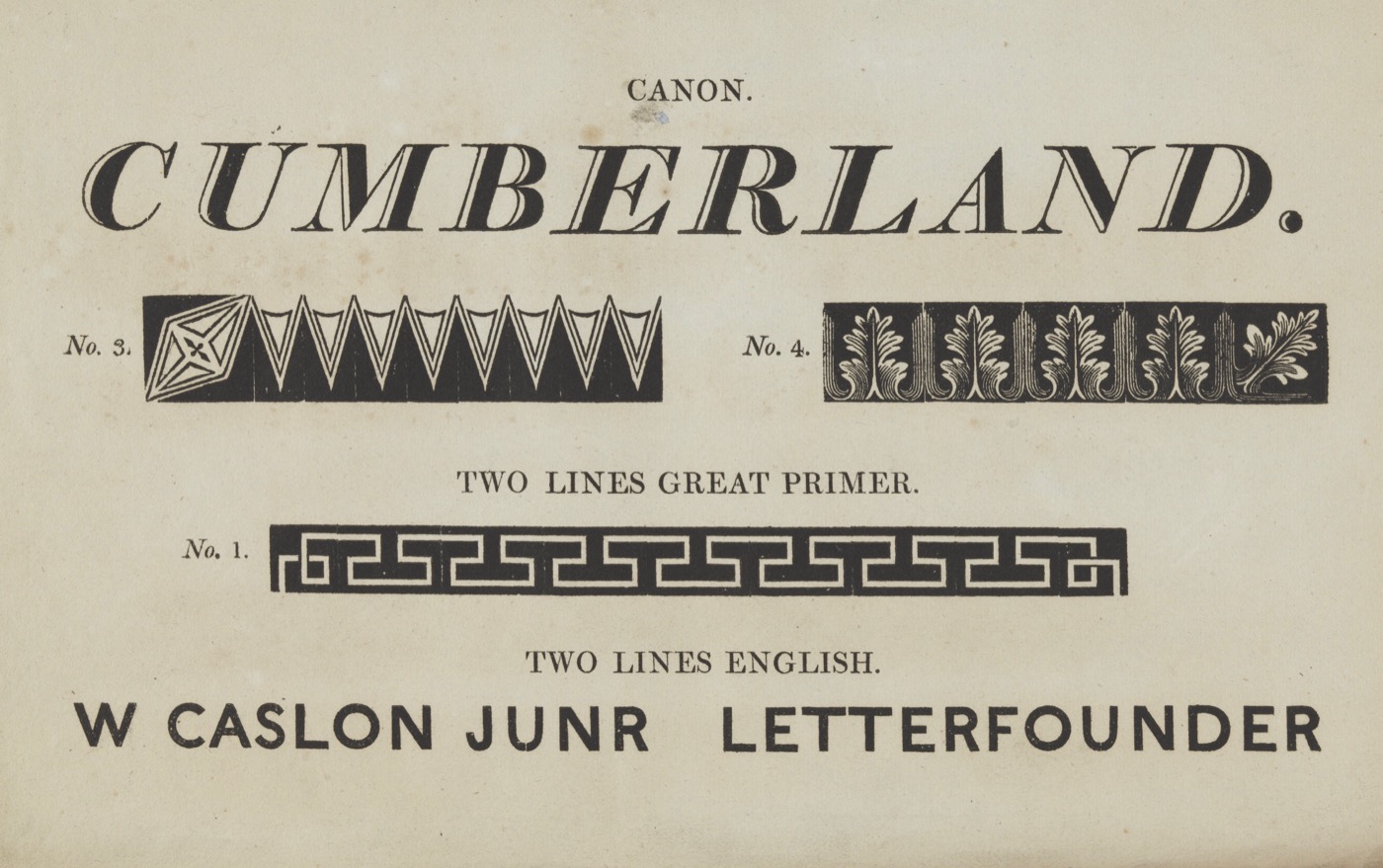
In his own foundry's final specimen book before selling up, William Caslon IV — great-grandson of the celebrated William Caslon — included a caps-only, numberless oddity technically named Two Lines English Egyptian: the first general-purpose sans-serif type known in the Latin alphabet. It landed with a thud; contemporaries found the stripped-down letters ugly and illegible next to the serif tradition they knew, and the style went nowhere for over a decade. Vincent Figgins didn't even coin the term "sans-serif" until 1832, and it took William Thorowgood's 1834 Seven Line Grotesque — the first sans-serif with a lowercase — to prove the idea could actually be set as real text, not just shouted in capitals.
 1920s–1930s
Geometric Sans & Modernism
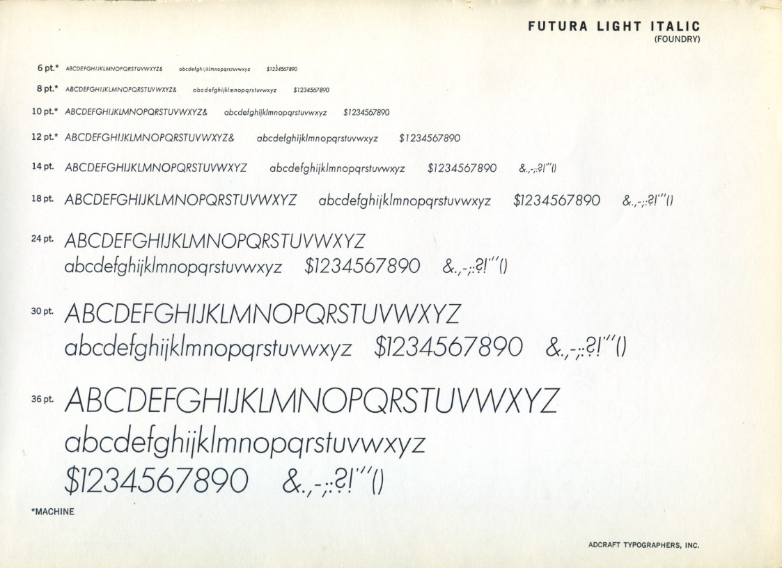
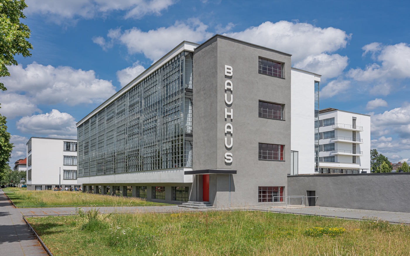
The Bauhaus treated the alphabet the way it treated a chair or a teapot: strip it to its structural essentials. Herbert Bayer's 1925 experimental Universal typeface went furthest, proposing to drop capital letters entirely — "the voice does not make capital sounds," he argued, "why then should the eye require them?" — though the design itself was never released as a working font. Paul Renner, sympathetic to Bauhaus ideals without ever teaching there, built a design that did ship: Futura, released in 1927 and constructed almost entirely from circles, triangles, and squares rather than historical letterforms. Its geometric confidence made it the era's definitive statement of modernity, later chosen — of all the world's typefaces — for the plaque Apollo 11 left on the Moon in 1969.
 1957
1957Helvetica & Univers
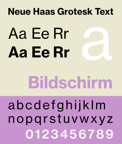
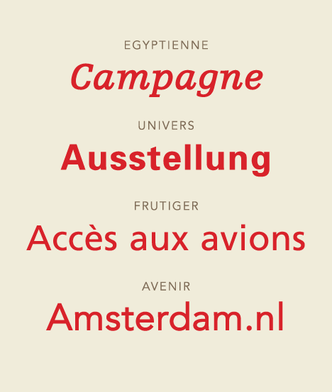
At Switzerland's Haas'sche Schriftgiesserei, Max Miedinger and Eduard Hoffmann reworked the 1896 workhorse Akzidenz-Grotesk into something tighter and more neutral, first sold under the unglamorous name Neue Haas Grotesk before an international rename to Helvetica in 1960 made it marketable worldwide. The same year, in Paris, Adrian Frutiger took a more systematic approach with Univers: a single family of 21 numbered weights and widths designed together from the start, rather than bolted on afterward. Between them the two typefaces became shorthand for the International Typographic Style's whole philosophy — a typeface should carry the message, not compete with it — and Helvetica in particular went on to become probably the most reproduced typeface in history, from IRS forms to the New York City subway.
 1984
1984Desktop Publishing & PostScript
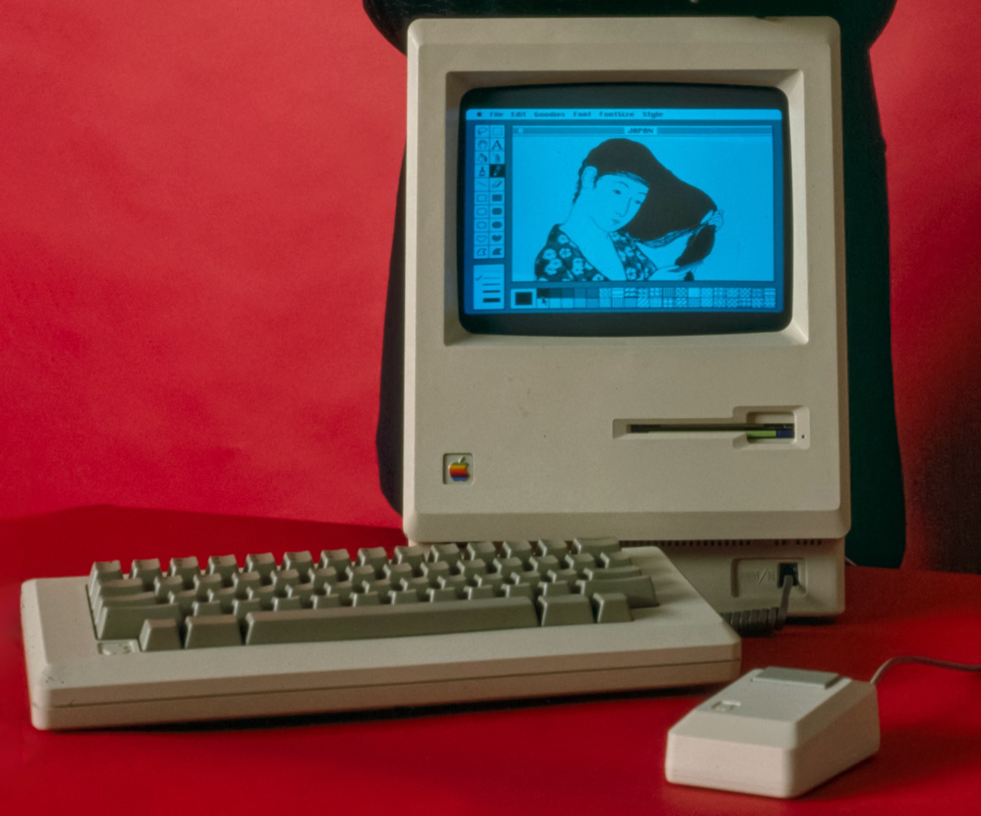
Three products arriving within two years of each other quietly ended five centuries of typesetting as a specialist trade: Apple's Macintosh in January 1984, its bitmap screen typefaces (including Susan Kare's Chicago) hand-drawn pixel by pixel; Adobe's PostScript page-description language, which let a printer render curves instead of dots; and Aldus PageMaker, software that put page layout on the same screen as the type itself. For the first time a single person, at a single desk, could set, design, and print a document that used to require a compositor, a proof press, and a stat camera — and typography stopped being something only professionals touched.
 1990s–2000s
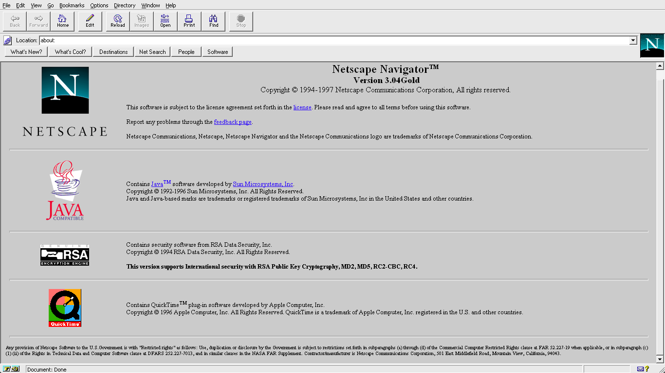
Web Fonts
The CSS2 specification defined an @font-face rule as early as 1998, and Internet Explorer 4 shipped support for it that same year — but font licensing fears (any linked font file could, in theory, be freely copied) kept it dormant for a decade, with almost every site defaulting to a handful of "web-safe" system fonts. Matthew Carter's Verdana and Georgia, drawn in 1996 specifically to stay legible on the low-resolution monitors of the day, were as close as most designers got to real typographic choice online. The turning point came in 2010 with WOFF, a compressed, licensing-aware format built with input from Mozilla, Type Supply, and LettError, which finally gave foundries a format they trusted enough to let designers use actual typefaces on the actual web.
 Hamburgerfont2016
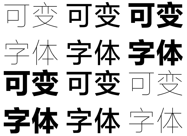
OpenType Variable Fonts
Apple, Google, Microsoft, and Adobe jointly published the OpenType Variable Fonts specification in September 2016, an addition to OpenType 1.8 that lets a single font file hold a continuous, steplessly interpolated range of weights, widths, and styles instead of a separate file per style. The performance case was immediate — one file instead of a dozen — but the creative case ran deeper: a typeface could suddenly respond live to its context, animating weight or width the way a headline might breathe on hover. It is the exact technology at the core of NBR's own typefaces.
Put it into practice
Explore variable fonts built on everything above, try live axes in Typebox, or browse the full library in the Shop.